Saturday, November 5, 2011

Walking Tour Marketing Materials

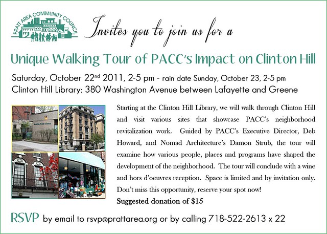
The Executive Director of PACC decided to hold a walking tour in Clinton Hill, Brooklyn. This was a pilot event and we decided not to go over the top with the event design and outreach. So the invitation was a simple design; Using the organization's colors, white background and simple fonts in the following styles- Script, bold, sans serif, and serif.


pacc walking tour invite


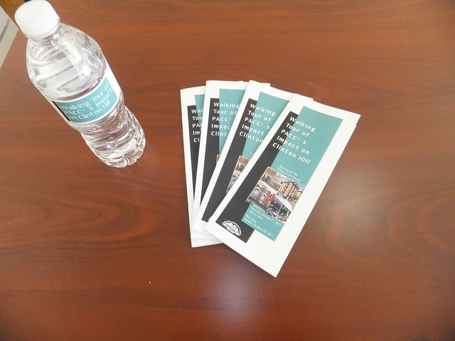
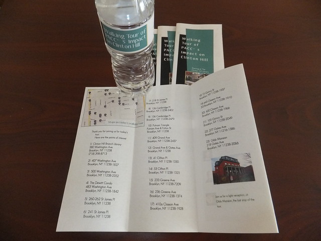
The event was by invite only. So when we got a nice number of people that had rsvp-ed, i decided to step it up a notch and provide folks with programs and water bottles. i think these turned out really good! I can't take credit for the layout, those i found online, but I was able to tweak the theme to reflect the colors and fonts in the invitation. Pretty cool for a small local gathering!


DSCF5300


DSCF5301

Thursday, November 3, 2011

40 Vanderbilt Avenue Marketing Campaign

40 Vanderbilt- A low income rental building in the Navy Green development in Wallabout Brooklyn for single adults. I created a website for this development, that can be viewed at www.40vanderbilt.org. Visitors were able to download applications and renderings up until the November 2 deadline. As of today's date, we successfully captured 49,859 hits to our website with .

From September to November 2011, 10K Postcards were strategically placed, distributed in target areas and dispersed during a mass mailing to low income renters throughout the city. Cards and posters for display were sent to about 500 Community Based Organizations, Churches, Shelters/Housing Agencies and NYC Elected Officials. Here is the card design, feel free to visit the website as we will be updating it periodically.


hi res postcard front


The back was designed with space for the postmark, stamp and US Post Office "Barcode" in mind. Positioning for the 5160 Avery Label was also take into consideration. Also, if you notice, I didn't include the rental price, Although rents are well below the market and range from $492-$664/month that was an effort to get more people to apply and to drive people to our site for more information.

hi res postcard back

Cards were printed at 4over4.com

DSCF5296

Wednesday, June 15, 2011

Dedication invites for the Stevens family

In June 2009, i had the opportunity to design some memorial ceremony invites for the Stevens family. Sadly, they had lost their little girl, Jacinda, in a car accident. The family contacted me again this past April. I was so ecstatic to hear they had just had twin boys! Ms Stevens wanted to go with the same layout: a 6 inch square (metallic) invite: logo on front, an insert and coordinating envelopes.

Here are some pics of the set. I dabbled with Jacinda's logo and realized. Twins=Yin Yang! Superb idea :) Continuity was an important factor in the design. I wanted to show that she is still in their hearts as they embark on a new chapter of their life as a family.

Here is the logo:

TwinsLogo1


The color scheme was green, blue with yellow as the accent color:

Assembly Line!


View of the front cover.


The colors were so Summery!

picnikfile_GGL_Qq

Here are the rest of the logo samples, enjoy!

Monday, April 25, 2011

Earth Day Celebration in Brooklyn

Hola! Peep this postcard and icon I designed for an Earth Day Planting in Bed-Stuy Brooklyn. Despite the weather, I hope you all did something for Earth Day, but if not come out to this gardening event taking place this Saturday the 30th :)


earthday2011icon


2011earthdaylogos